I Compared MNIST-Style Digits Across Languages. Mandarin Chinese Was 4x Harder to Separate
I started with a joke about "Linear Mandarin" and ended up with a measurable result: in this PCA experiment, Mandarin Chinese digits were about 4x harder to separate than English MNIST.
Introduction
I came across this tweet:

And for a second I even thought this wasn't real, because the symbols look really hard to distinguish among themselves.
Which made me think that there must be a way for us to quantify that.
This immediately reminded me of one of my favorite data visualization examples using MNIST dataset with PCA. And so I wondered if we could explore different numerical systems from different languages with the same approach, and compare the cluster centroids mean to extract a "difficulty" proxy.
The data
I looked for real MNIST-style handwritten digit datasets where the actual written symbols differ. If I could not find a real equivalent dataset, I dropped that language.
The final set was:
- English, from OpenML MNIST 784
- Mandarin Chinese, from a Chinese MNIST dataset
- Hindi, using Devanagari digits
- Arabic, using Arabic-Indic digits
- Bengali
- Urdu/Persian
- Telugu
Here are representative samples from each dataset. I picked one sample per digit close to that digit's PCA centroid, so these are meant to be boring examples rather than outliers.

sample #30

sample #450

sample #645

sample #875

sample #1169

sample #1272

sample #1714

sample #1791

sample #2048

sample #2265
Why PCA
At this point I needed a way to make the comparison visual. This is where PCA (Principal Component Analysis) comes in.
PCA is still one of my favorite machine learning algorithms. Part of that is because it is simple enough to understand intuitively. You have high-dimensional data (e.g. a vector of dimensios pixel width x pixel height), you find the directions where it varies the most within a dataset, and you project the data onto those directions.
If you are unfamiliar, this is a good place to get started.
When I was writing my paper that got accepted to ICMLA, I used PCA to understand whether the raw sensor data had a shape that could be useful for classification. Wrote more about that here if you are curious: How I wrote a machine learning paper in 1 week that got accepted to ICMLA.
This digit experiment is much lower stakes, obviously.
But it takes on the same idea, take something high-dimensional and make it visible.
English MNIST first
I started with normal MNIST because that is the reference point everyone knows.
Each image is 28x28 pixels, which means each sample starts as 784 dimensions. I flattened the image into a vector, normalized it, and projected the samples into two dimensions using PCA.
Mechanically, PCA does not really care that the input started as an image. It wants a table.
So the image has to be flattened first. I take row 1 of pixels, append row 2 after it, then row 3, and keep going until all 28 rows are joined together. That turns a 28 x 28 image into a single row with 784 pixel values.
Below I used one actual MNIST sample from the dataset. It is an English 2, sample #645. The zoomed patch makes the transformation more concrete: the bright stroke pixels are just large grayscale values, and their position in the image decides their position in the vector.
0 to 255. Dark cells are near zero; bright cells are part of the stroke.28 x 28 = 784 pixel values.#645 end to end: row 0, then row 1, all the way to row 27.2500 x 784.X with shape samples x 784. Multiplying by the first two principal directions creates Z with shape samples x 2. Those two values are the PC1 and PC2 coordinates.After that, the dataset is just a matrix. Each row is one digit sample. Each column is one pixel position. If I have 2,500 English samples in the plot, the PCA input table has shape 2500 x 784.
PCA centers each pixel column, then finds the directions through the 784-dimensional pixel space where the samples spread out the most. The first direction is PC1, the second is PC2. When I plot those two coordinates for each sample, I get the 2D chart below.
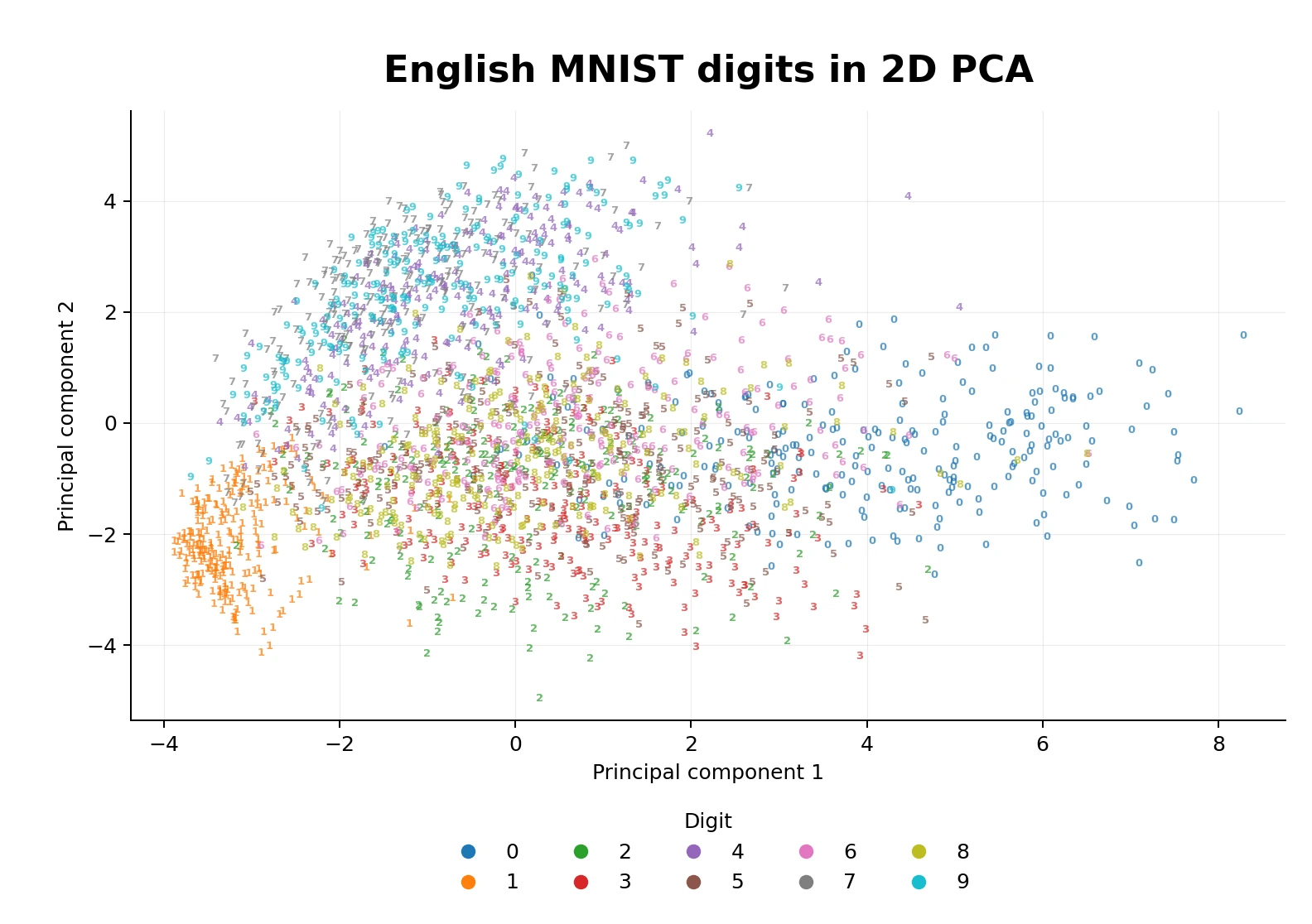
Note that it does not know what a 3 or an 8 means. It just finds the two directions that explain the most variance in the pixel data, and projects each sample against those.
Some digits pull apart clearly. 1 has its own region because it is visually sparse. 0 also tends to carve out space because the loop shape is so distinctive. But a lot of digits overlap because two dimensions is brutally compressed. 3, 5, 8 and 9 aren't too far from each other.
This is expected, and "explains" in a way, why sometimes we can find it harder to distinguish between those numbers.
Then the other numeral systems
After that I ran the same process for the other datasets.
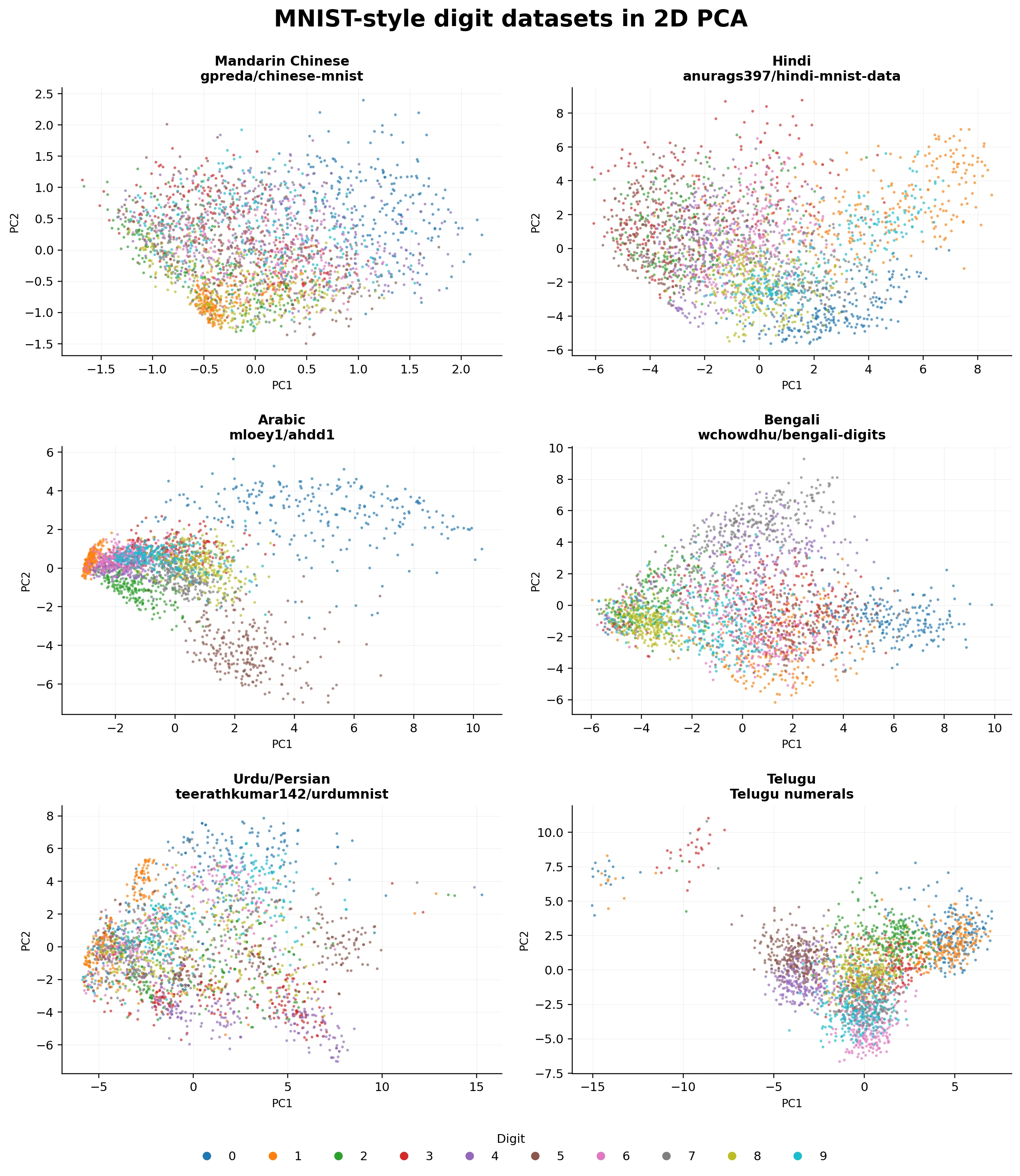
Each language dataset has a different "footprint".
Mandarin Chinese is the most compressed in this 2D view.
This confirms our initial assumption, that the characters have very similar stroke structures and that for a PCA with 2 dimensions, it's hard to "tell them apart".
However, I must say that given the sample mandarin data (from the first image shown), this could also be due to the dataset where the characters are more "squeezed" in the center of the matrix - which makes it harder to distinguish between numbers given all of them will have an "empty" surrounding area.
A small metric for separation
To make the comparison less hand-wavy, I computed a simple centroid separation score.
For each dataset:
- Compute the 2D PCA coordinates.
- Compute the centroid of each digit class.
- Compute all pairwise distances between those ten centroids.
- Take the mean distance, with the min and max shown as the error range.
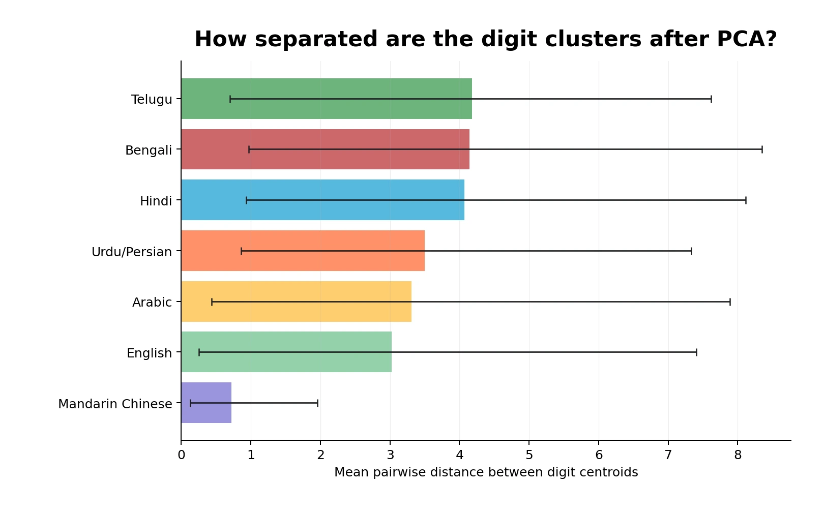
This is not a universal measure of how "easy" the dataset is.
It only says: after reducing the images to two PCA dimensions, how far apart are the class centers?
The ranking I got:
- Mandarin Chinese:
0.72 - English:
3.02 - Arabic:
3.31 - Urdu/Persian:
3.50 - Hindi:
4.07 - Bengali:
4.15 - Telugu:
4.18
I would not over-interpret the exact values because the datasets were collected differently - and as I mentioned, the Mandarin chinese does seem to be slightly lower quality than others.
But as a visual summary, it is still useful. Telugu, Bengali and Hindi have the largest class-center separation in this PCA view. English MNIST, which we tend to treat as the default digit dataset, is somewhere in the lower middle.
Mandarin Chinese is the clear outlier in the other direction. Its digit centroids are much closer together than every other dataset here.
So for this experiment, I think it is fair to say Mandarin Chinese is the hardest numerical system to recognize by sample proximity alone.
Not "hardest" in some universal language-learning sense. Hardest in the specific sense that if I only give myself this 2D PCA space and ask which handwritten numerical values sit closest to each other, Mandarin Chinese gives me the least separation.
The explorer
The static plots were fun, but I thought I could build a nicer more interactive HTML explorer that would allow me to look to the data. After all, you always want to look at the data. ALWAYS!
You can switch datasets, keep the same digit colors, zoom and pan the PCA plot, click a sample, and inspect the selected image plus the five closest samples in PCA space.
The code is here: DidierRLopes/mnist-explorer.
Conclusion
Under this PCA centroid-separation proxy, Mandarin Chinese is about 4.2x less separated than English MNIST and about 5.8x less separated than Telugu. So if I treat inverse separation as a rough difficulty score, Mandarin Chinese is about 4x harder than English and nearly 6x harder than Telugu in this experiment.
POST EDITS
I got two useful pieces of feedback on X after the first version of this post.
0xDataWolf pointed out that "The handwriting is bad in this dataset and its not sized correctly," especially for the Chinese numbers 4, 5, 6, and 9, which looked too small. They also made the point that stroke-level details matter on top of the overall character shapes.
That criticism is fair, and I did mention above to not over index on the results obtained - but at the same time I didn't want to tamper with the orignal dataset.
In any case, I thought it would be a nice experience to reran the experiment with a stricter preprocessing step designed to remove as much of that formatting difference as possible.
Sohan added: "When you look at the pairwise distances, look at the spread." That is why I added the centroid-distance distribution plot below instead of only reporting the min, max and mean.
Pre-processing
For this rerun, every sample goes through the same pipeline:
- Convert each source sample into a single-channel image. For image-file datasets, that means converting RGB files to grayscale first.
- Scale pixel values into
0-1. - Check the border pixels to infer the background. If the border is bright, invert the image so every dataset uses the same convention: bright glyph, dark background.
- Normalize by the sample's maximum intensity.
- Remove large mid-gray background artifacts connected to the border, then normalize again.
- Threshold at
0.2into a binary image. Internally pixels are0or1; when rendered, they become pure black/white pixels. - Crop to the non-empty foreground bounding box.
- Resize proportionally with nearest-neighbor interpolation until the longer side touches the
28 x 28frame. - Crop and resize once more after interpolation to avoid leftover edge padding.
- Center the shorter side on the remaining axis.
This keeps the glyph shape but removes grayscale intensity and most of the padding effect. The samples below show the representative examples from the original post on top, and the standardized version underneath.


sample #218


sample #308


sample #593


sample #900


sample #1102


sample #1449


sample #1633


sample #1993


sample #2028


sample #2392
Updated results
Then I reran the same shared 2D PCA centroid calculation with those standardized samples. The original result is on the left; the standardized rerun is on the right.
Before standardization
After standardization
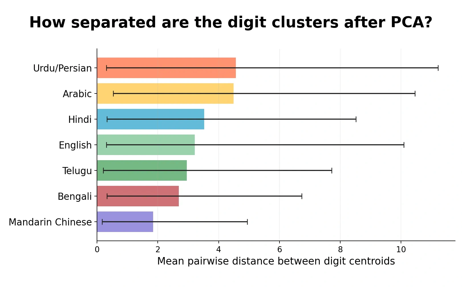
The ranking changes. Mandarin Chinese is still the least separated numeral system, but the gap is much smaller. English is now about 1.7x farther apart than Mandarin Chinese in mean centroid distance, not about 4x.
So I would now phrase the result more carefully: Mandarin Chinese still looks hardest under this 2D PCA centroid proxy, but the original headline-sized gap was partly driven by dataset-level image formatting and padding, not only by the symbol shapes themselves.
Centroid spread
Given that each numeral system has ten digit centroids, there are 45 pairwise centroid distances. The mean can hide whether all digit pairs are moderately separated or whether a few pairs are very far apart while others are almost touching.
The plot below shows those 45 distances for each numeral system. The colored shape shows the distribution, the box shows the interquartile range, and the dots are the individual digit-pair distances.
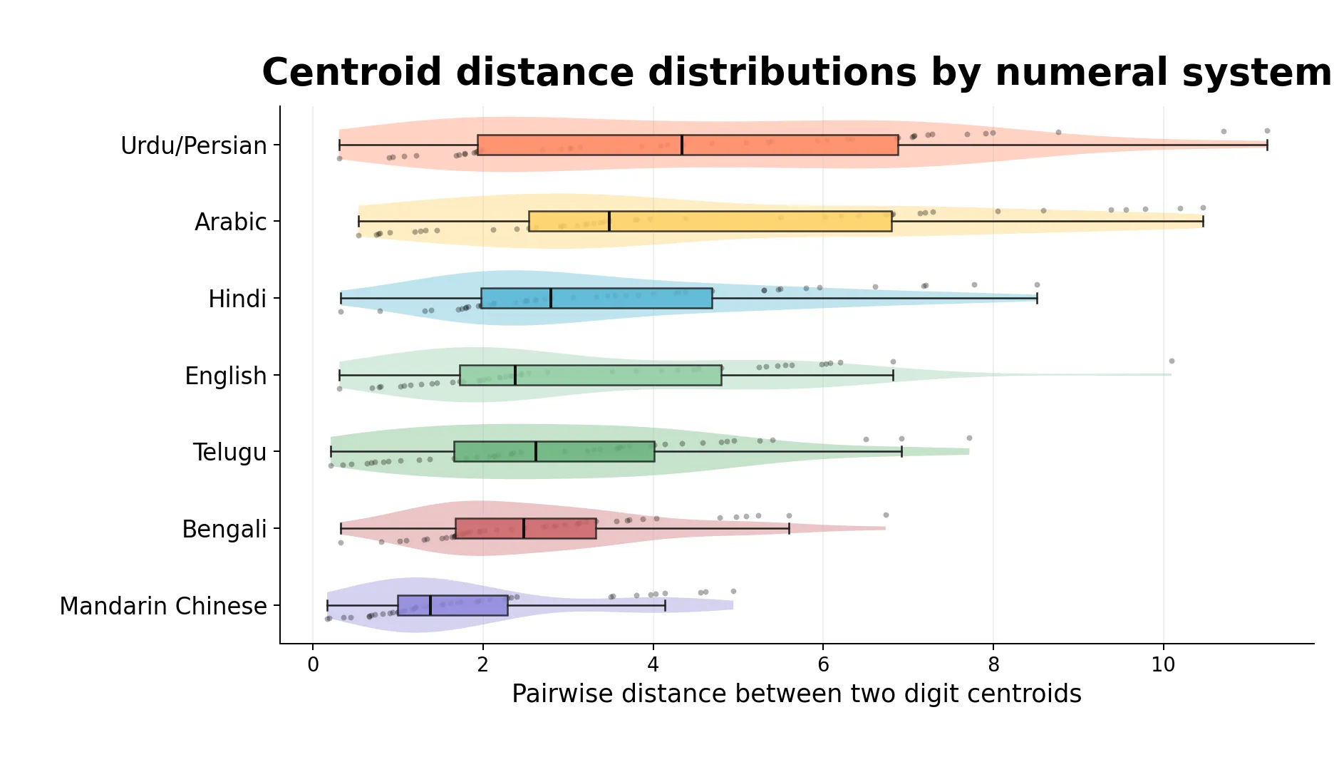
The spread is large across every dataset, which is a useful warning: even when the average separation is high, some digit pairs are still close together in this 2D PCA view. Mandarin Chinese has the lowest mean and the tightest overall spread, while Urdu/Persian and Arabic have the largest mean separations but also the widest ranges.